Best Color for Resumes
Like every job applicant, you want to make your resume stand out. As you optimize your application documents, you might wonder, “Should I add color to my resume?” Adding a touch of resume color might just differentiate you from the competition. However, it’s vital that you choose good resume colors. Learn more about putting color on resumes so you can identify the best shades for your application.
Should you add color to your resume?
First impressions matter immensely in job applications. When a hiring manager reviews your resume, the design and color scheme will have an immediate impact on their perception of you. Color psychology plays a vital role here.
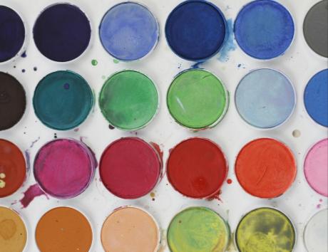
Resume color psychology is the study of how various colors can affect someone’s behavior and mood. This exciting field explores how a colorful resume can influence emotional responses and make certain aspects of your document more memorable. (1)
Research has shown that colors will influence how readers perceive and interpret the information they are presented with. Different colors evoke various emotions and responses. Color can either help you stand out or make the wrong impression. (2)
Color can be a good addition to your resume. However, it’s important to consider industry norms and trends so you can create an application that aligns with the hiring team’s expectations and preferences.
Even if color on resumes isn’t the norm in your field, there are still ways to make your application documents stand out. For example, you can add resume icons next to your email address and LinkedIn profile to break up the text.
Best colors for resumes
When it comes to putting color on resumes, five options stand out as the most versatile and useful.
Black
Black is timeless and conveys a sense of professionalism and authority. It’s ideal if you are applying for corporate roles or you work in an industry where a formal and traditional appearance is preferred. Black text on a white background makes your documents easy to read.
However, just because you use black doesn’t mean your resume has to be boring. Use bold headers with a slightly larger font than your body text to make your documents easier to skim through. You can also use borders and other subtle design elements to make your resume look clean and crisp.
Navy blue
Navy blue is another excellent choice for a resume color. It suggests reliability and trustworthiness. These qualities are highly valued in most professional settings.
Navy blue can make your resume look polished and serious. Consider weaving the color into your headers and borders. You can also use it to draw attention to key sections of your documents, including your experience and education headers.
Gray
Gray can convey a modern and sophisticated vibe. It exudes neutrality and quiet professionalism. Gray can be a great choice for adding a modern touch to your resume without being overpowering. You might want to use gray if you work in a formal, tradition-minded sector but want to subtly differentiate yourself from other applicants.
You can use gray in the headings, on the borders, or as an accent color. It pairs well with other colors, including black and navy blue. Don’t use it as your font color, as it may make your resume harder to read.
White
White is essential for creating a clean and uncluttered resume. Obviously, you don’t want to use white font or accents, as they will get lost in the paper. However, you shouldn’t try to fill every square inch of your resume with colors and accents either.
It’s vital to let your application documents breathe. Strategically using white in your resume can highlight key sections and prevent readers from getting lost in overcomplicated designs or huge blocks of text.
Dark green
Dark green is best suited for creative fields or industries that value innovation. It suggests growth and stability. Using this color in moderation can make your resume stand out without appearing too flashy.
Avoid brighter greens, as they can come off as noisy, brash, and unprofessional. Stick with darker options, like forest or hunter green.
Expert Tip:
Colors to avoid on resumes
You can’t just slap any color on resumes and expect it to go over well with hiring managers. Even if you work in an industry where creative resumes are the norm, there are a few colors you should avoid.
Bright red
Bright red is associated with urgency and aggression. While it can attract attention, hiring teams may also perceive the use of red as overly bold or even cocky. It’s best to avoid using bright red altogether, even in small amounts.
Generally, you should avoid any bright or loud colors. If you are going to brighten up your resume, stay away from red and be sparing in your application of color.
Neon colors
Neon colors are highly vibrant and can make your resume look unprofessional. They can be hard on the eyes and may distract from your text.
Stick to more subdued and professional colors to maintain a polished look. Focus on complementary colors like those discussed in the previous section.
Pastels
Pastel colors aren’t in your face like neon or bright red. However, they can make text difficult to read and may come across as too casual.
If you choose to use pastels, ensure they are used sparingly and with high-contrast text. Make sure your copy is easy to read and that there is plenty of white background between the pastel accents and your text.
For more do’s and don’ts, check out some resume examples.
"Research has shown that colors will influence how readers perceive and interpret the information they are presented with."
Tailoring resume colors to industry
Different industries have varying preferences when it comes to resume colors. Tailoring your choices to match industry norms will make your resume more effective.
For instance, hiring teams expect bright colors on resumes for UX designers. However, more traditional industries like finance or law might prefer a more professional and concise cover letter and resume. Here’s a closer look at three main industries and their color preferences:
- Corporate/Finance: Conservative colors like black, navy, and gray are preferred
- Creative Industries: More flexibility is allowed; dark green, muted tones, or even color combinations may be acceptable
- Tech: Modern and sleek colors like navy or gray are often favored
Keep in mind that these are general rules and don’t apply to every industry or business. Get to know the company you are applying to and adjust your resume to appeal to that hiring team’s sensibilities.
How to implement colors in your resume
After you’ve identified the best color for resumes in your industry, it’s time to implement your chosen color palette into your application documents. Start by choosing a resume template that can accommodate colors.
Once you’ve selected the right cover letter and resume templates, use the following tips to strategically integrate color into your documents:
- Use color for headings, borders, and subtle accents
- Ensure text remains readable with high contrast
- Explore examples of well-designed resumes
Check out Jobseeker and our collection of resume and job letter templates. These resources showcase well-designed resumes with tasteful color usage and provide inspiration for your own documents.
Take care when using color on your resume
Selecting the right colors for your resume is an important design choice and can help you position yourself as a strong candidate. Thoughtful color choices can also influence the hiring team’s decision-making process and may even make your documents more memorable. However, it’s vital that you do your homework and choose colors consistent with industry norms and hiring manager preferences.
Need more insights about putting color on resumes? Check out Jobseeker and our library of resume articles. Our resources also include cover letter examples and templates you can use to make your application stand out.
Sources:
(1) Very Well Mind: Color Psychology: Does It Affect How You Feel?
(2) Britannica: The Psychology of Colour

Impress potential employers with your resume
Follow step-by-step professional guidance to create a polished resume in minutes.